Unifyth
Conceptual Rationale for the Symbol: UNIFYTH
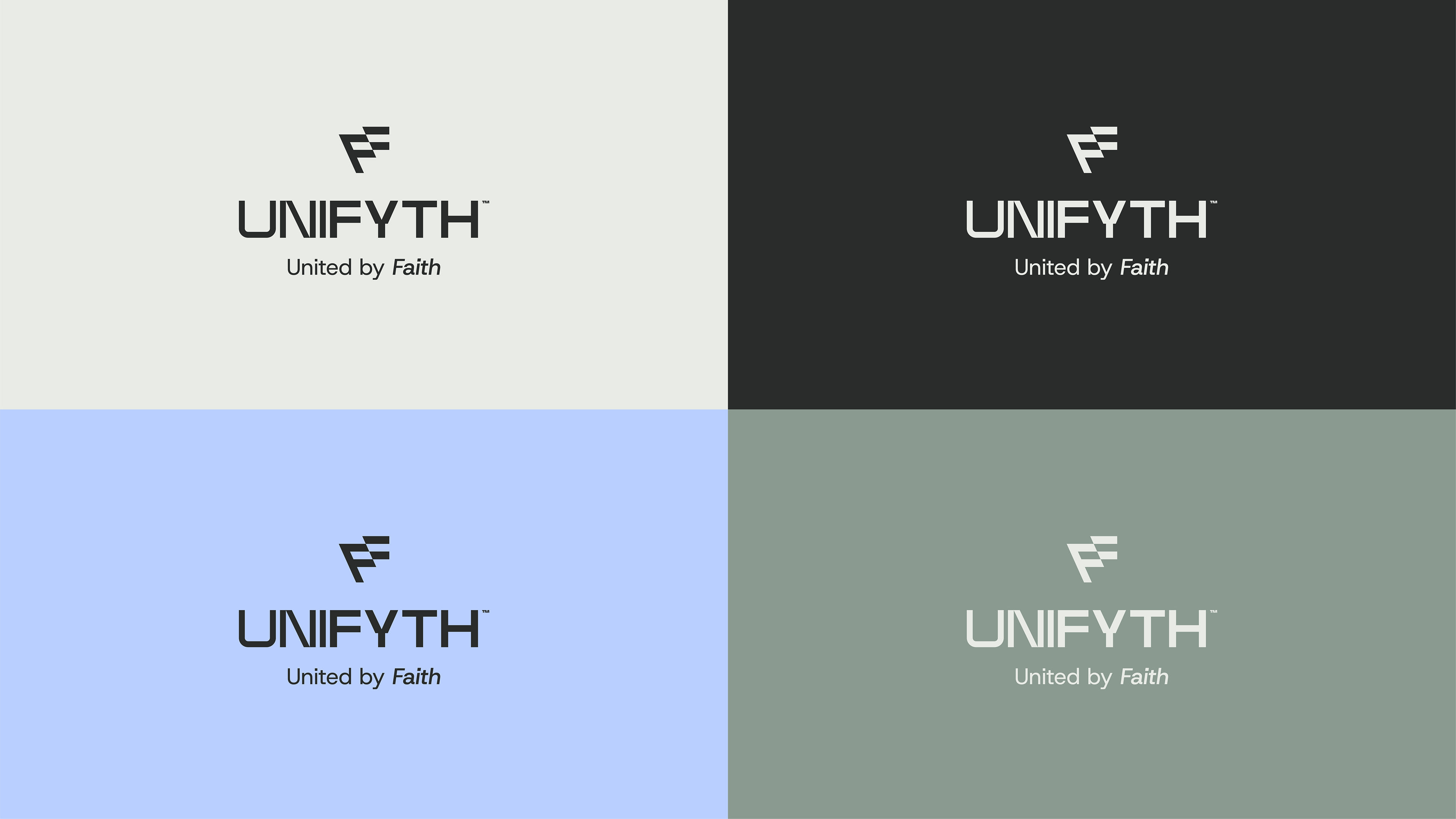
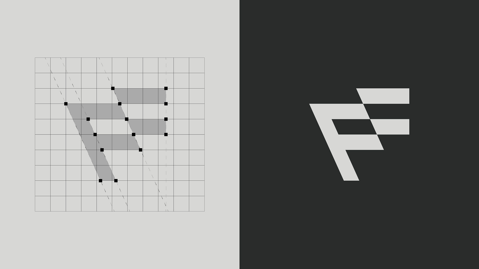
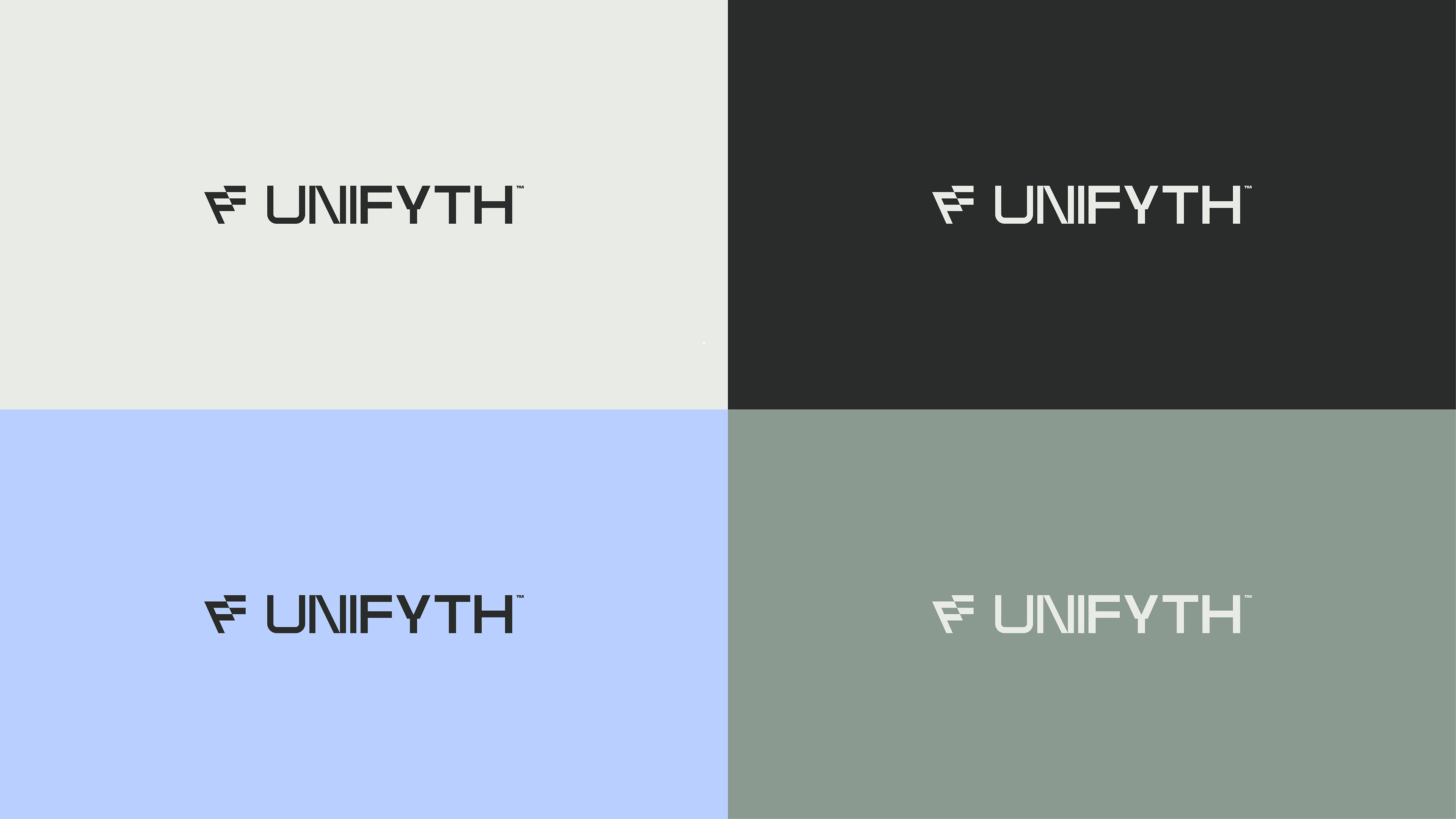
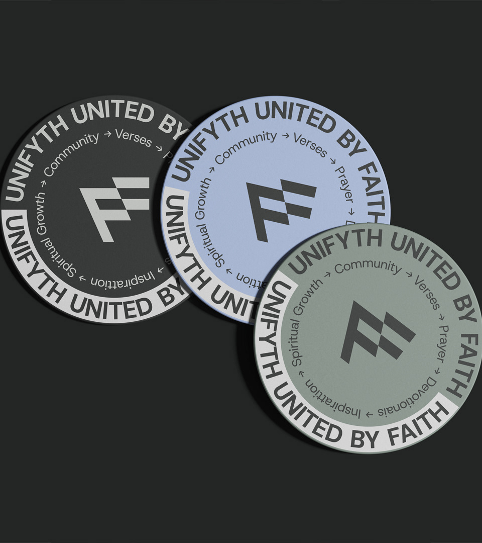
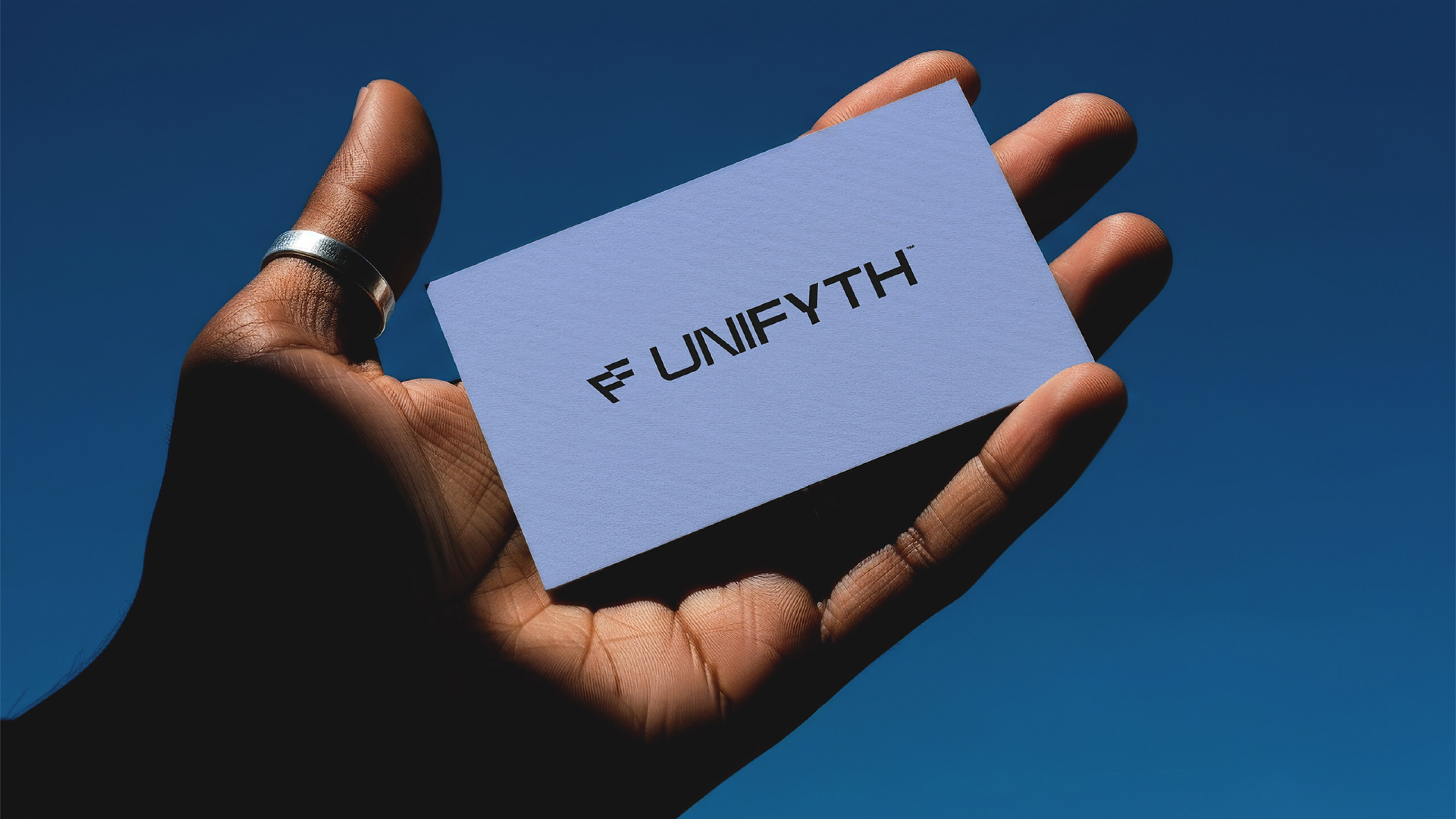
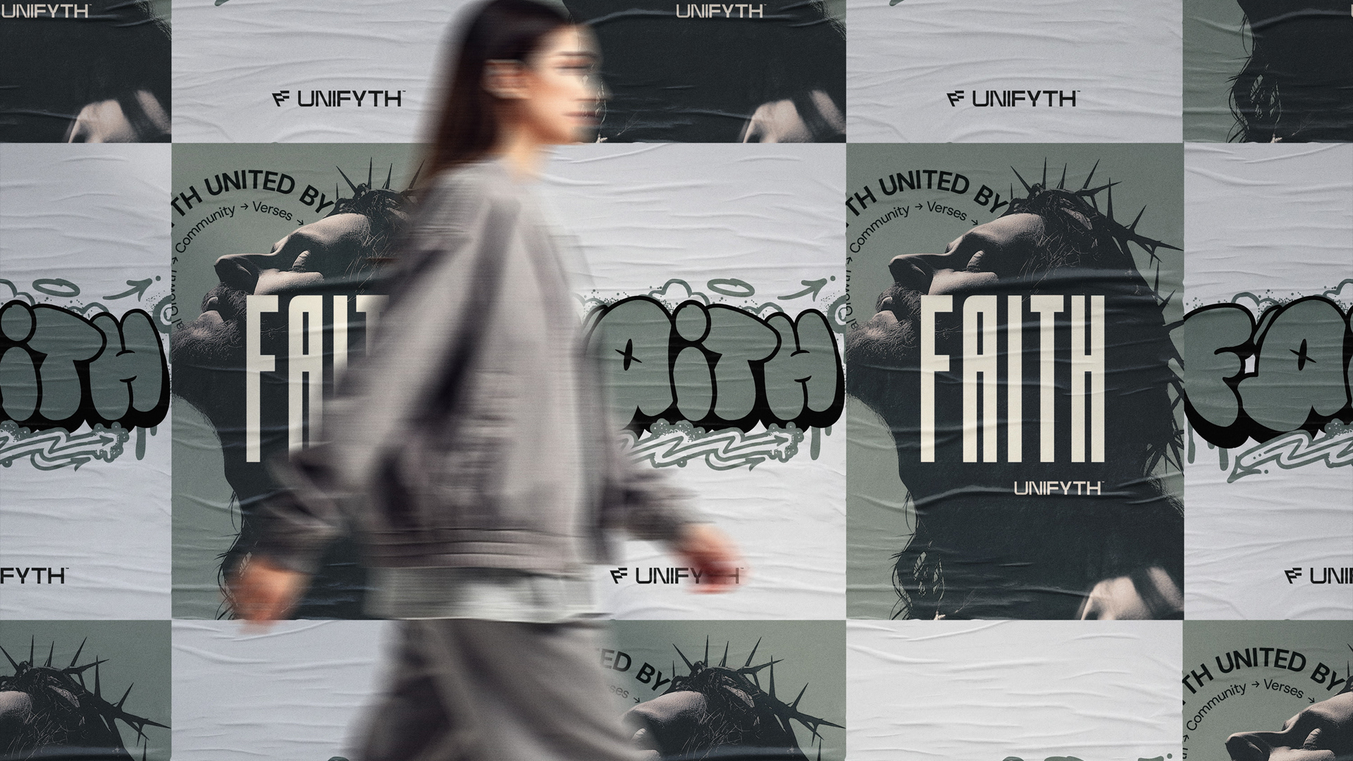
UNIFYTH’s visual identity stems from the need to unite the expression of faith with contemporary lifestyle, moving away from traditional and literal approaches. The new symbol completely discards any visual link to religion or figurative elements. The result is a geometric, minimalist, and sophisticated representation of the letter "F", which abstractly conveys the convergence between the individual, the community, and spiritual purpose.
UNIFYTH’s visual identity stems from the need to unite the expression of faith with contemporary lifestyle, moving away from traditional and literal approaches. The new symbol completely discards any visual link to religion or figurative elements. The result is a geometric, minimalist, and sophisticated representation of the letter "F", which abstractly conveys the convergence between the individual, the community, and spiritual purpose.
1. The Structure of the "F" (Faith and Foundation)
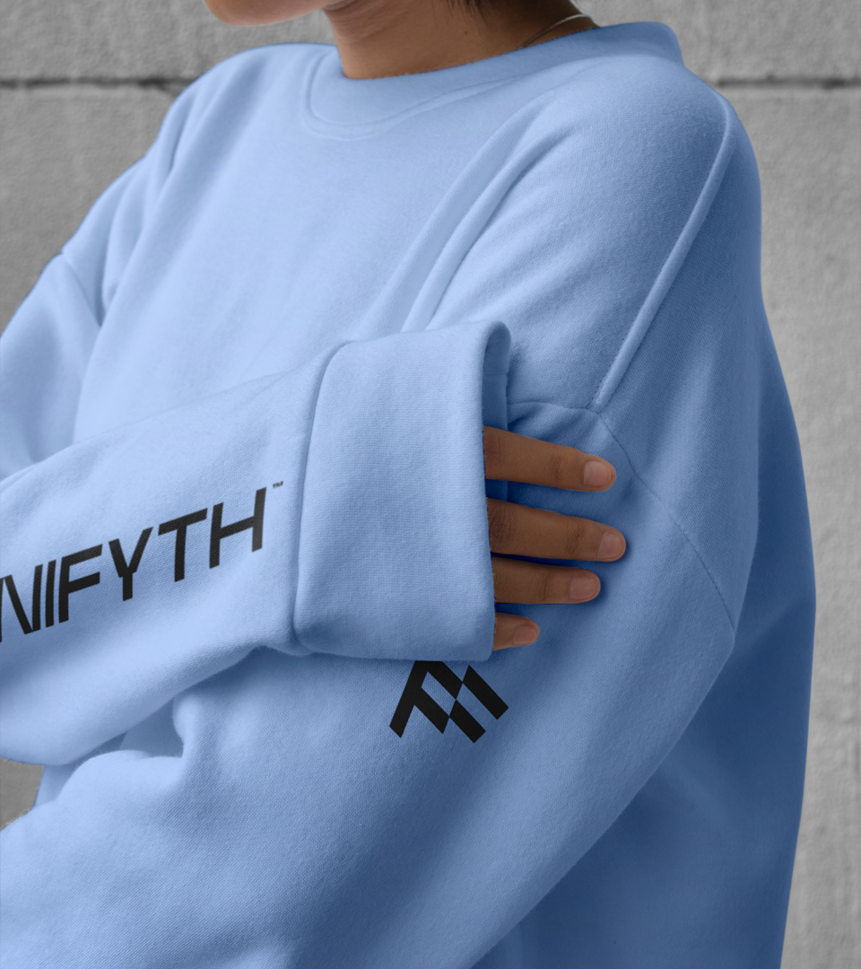
The icon uses solid geometric shapes and precise intersections to form the letter "F", representing the essence of the word "Faith".
The icon uses solid geometric shapes and precise intersections to form the letter "F", representing the essence of the word "Faith".
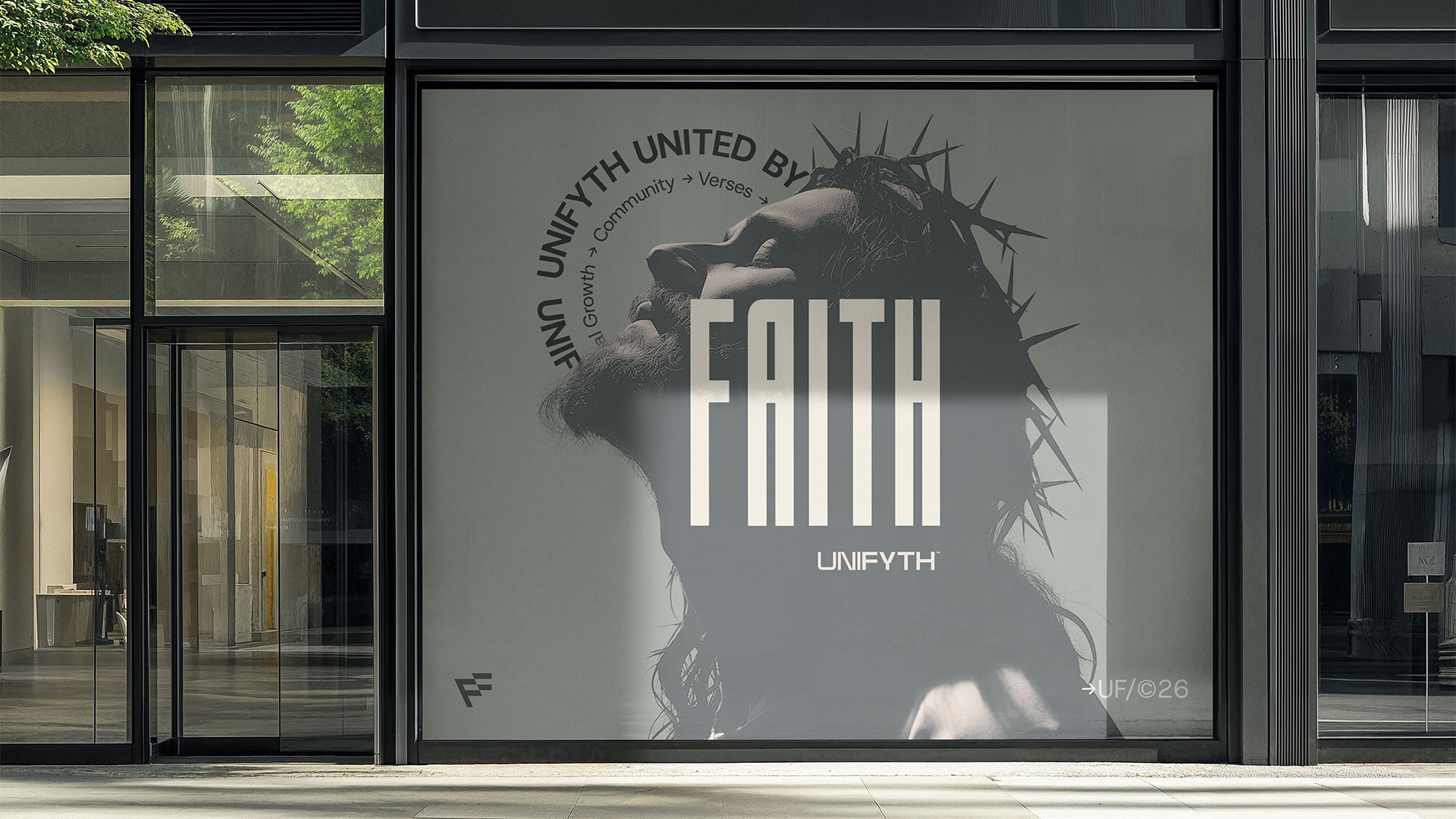
Instead of resorting to religious clichés or crosses, the message is communicated in a non-traditional way, focusing entirely on meaning, identity, and lifestyle.
The design conveys a sense of excellence and stability, fundamental values required to sustain the brand’s premium positioning.
2. Perspective and Movement (The Axis of Purpose)
The design features an intentional tilt in its main pillar, breaking away from static forms and creating a sense of forward movement and perspective.
The design features an intentional tilt in its main pillar, breaking away from static forms and creating a sense of forward movement and perspective.
This architectural and modern structure reflects the goal of living a faith-guided life in the contemporary world.
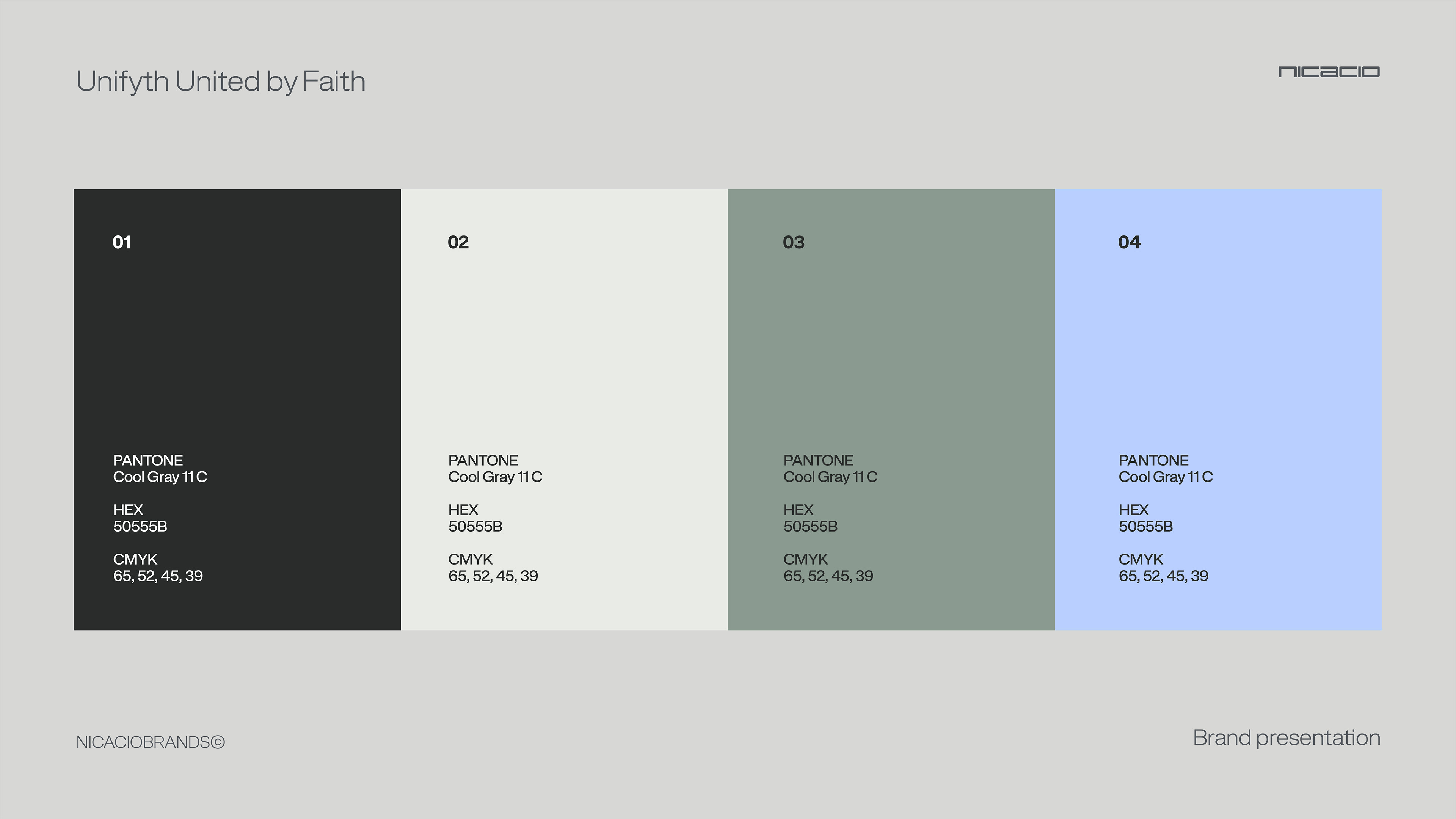
The clever use of negative space between the blocks evokes unity and integration, reinforcing the mission of connecting people beyond their backgrounds through a shared purpose.
3. Minimalism and Versatility
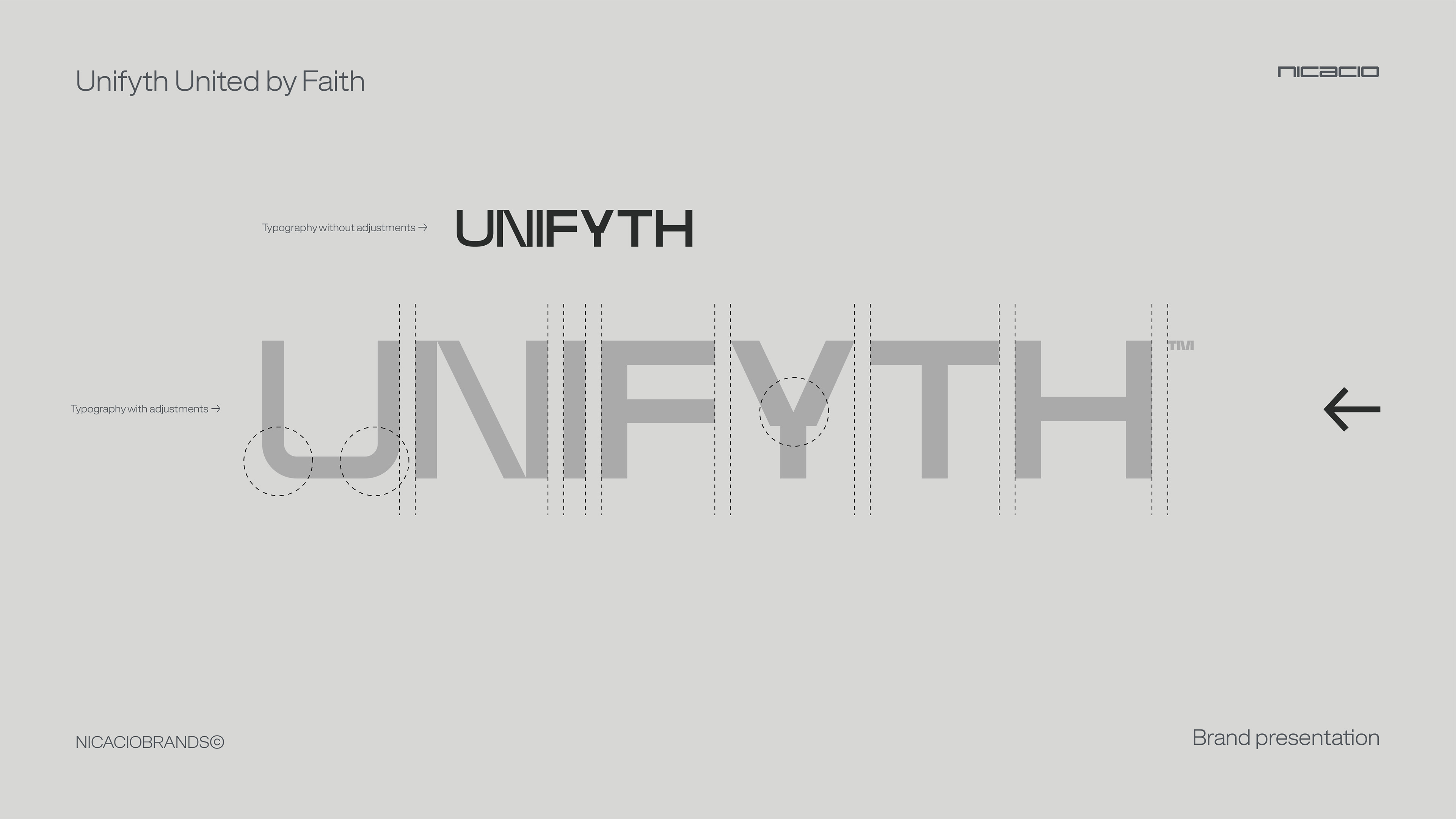
Following the guidelines of premium and editorial design, the symbol avoids decorative excesses and any childish elements, maintaining a clean and elegant composition.
Following the guidelines of premium and editorial design, the symbol avoids decorative excesses and any childish elements, maintaining a clean and elegant composition.
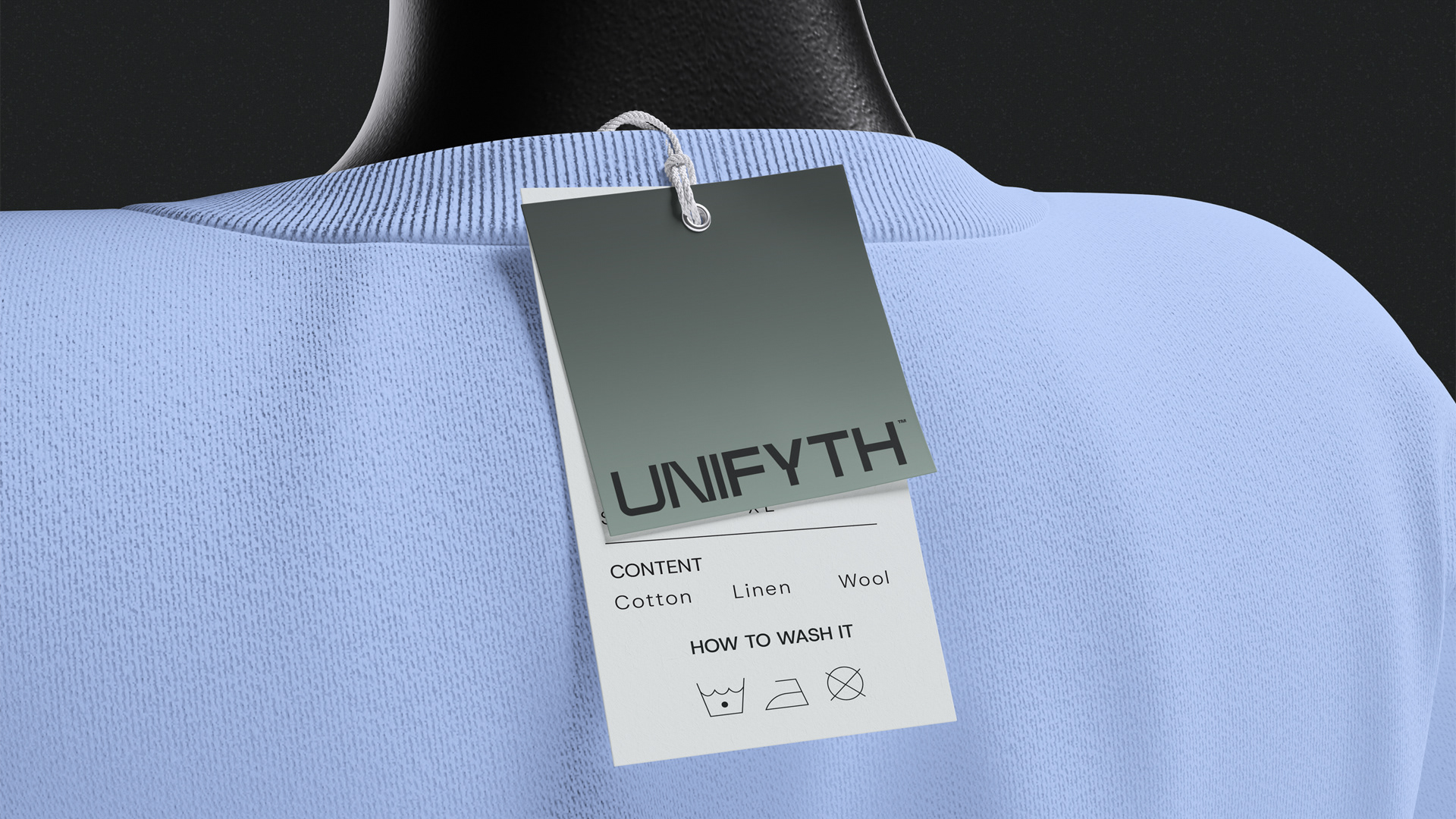
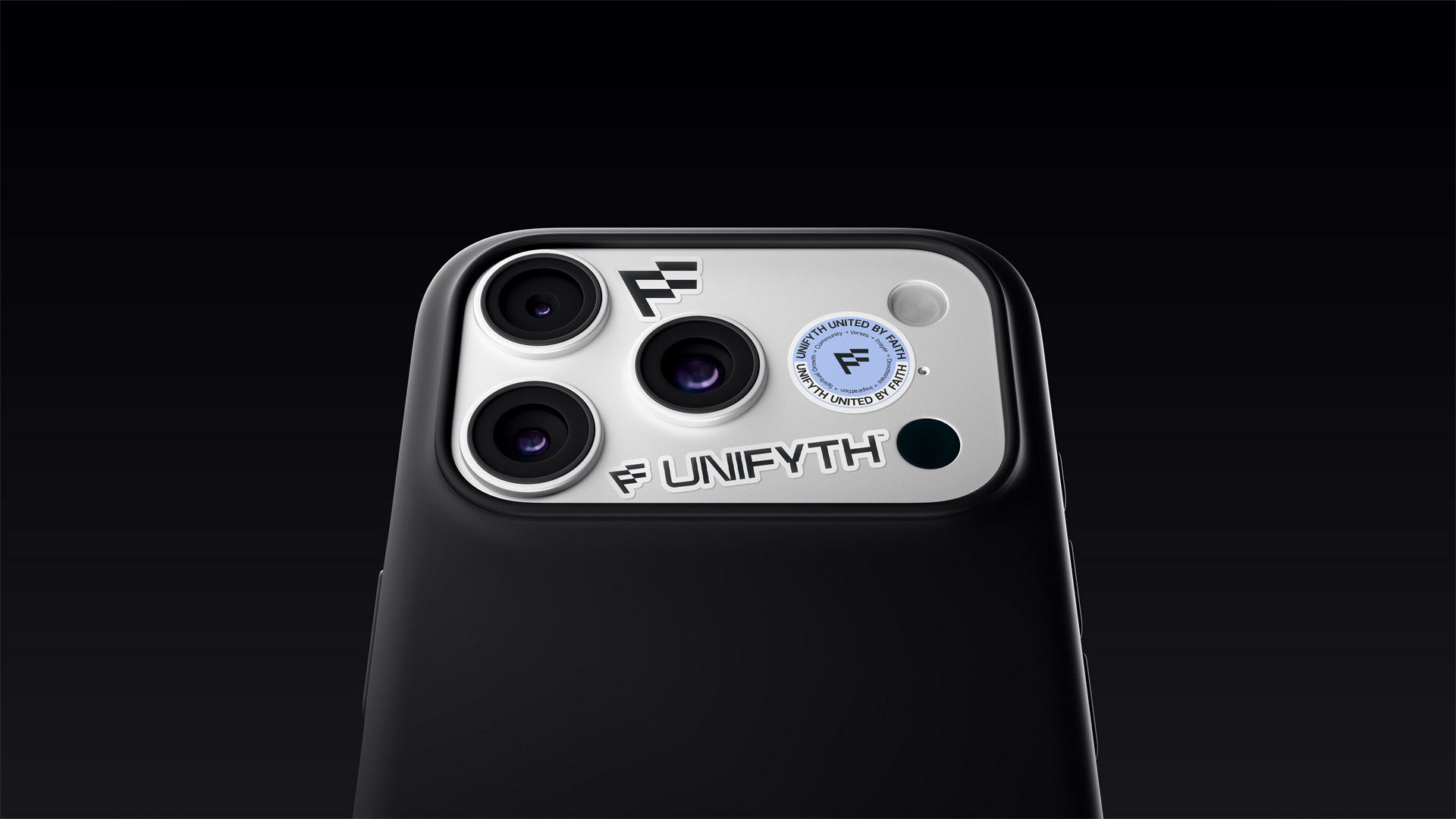
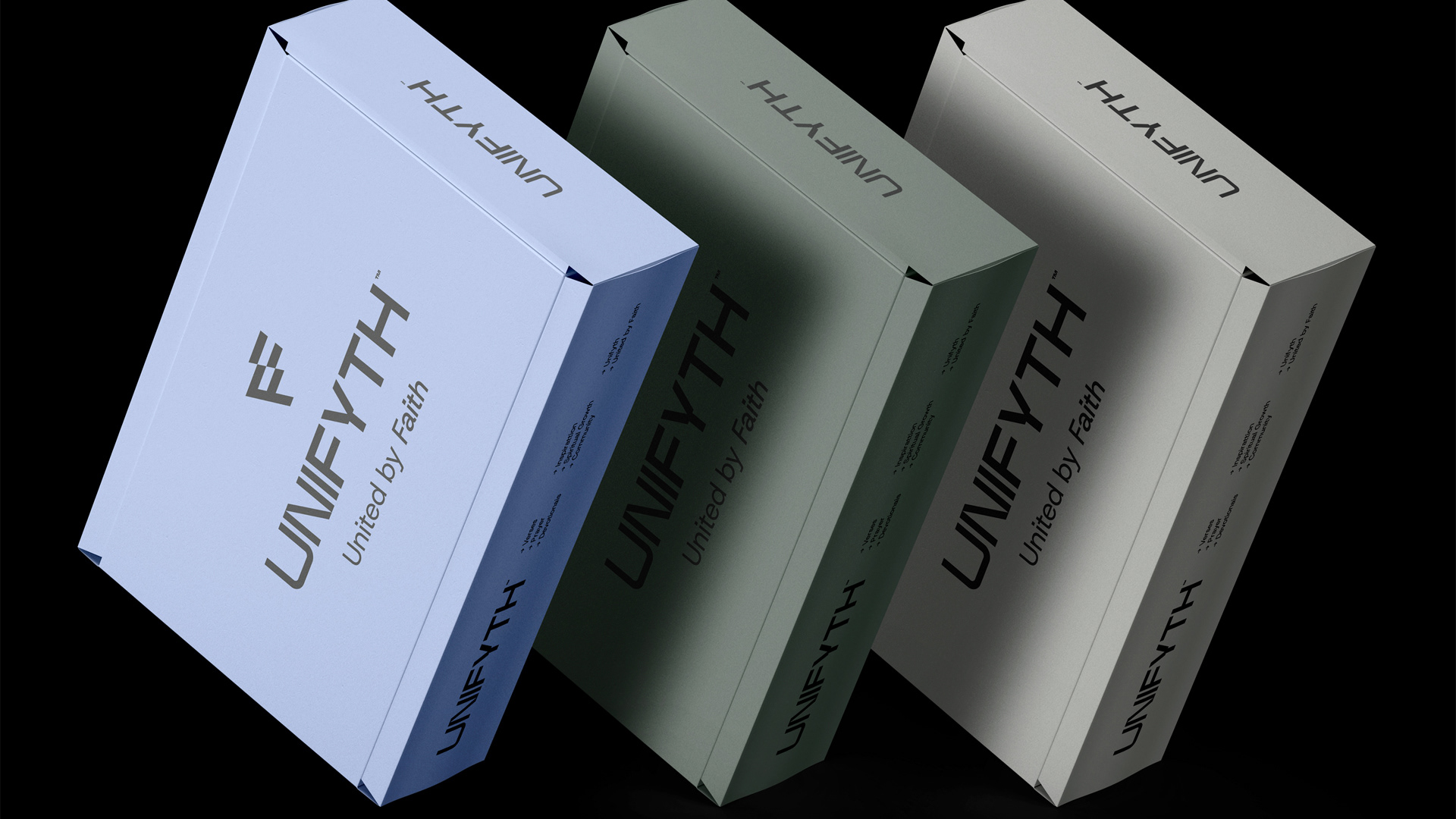
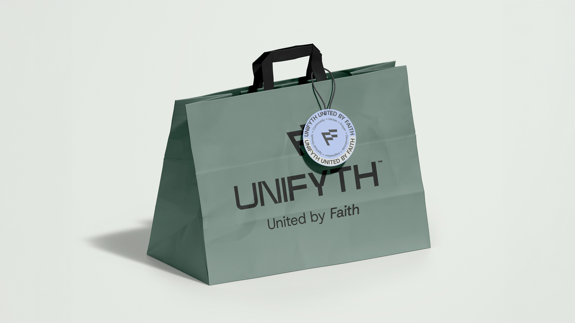
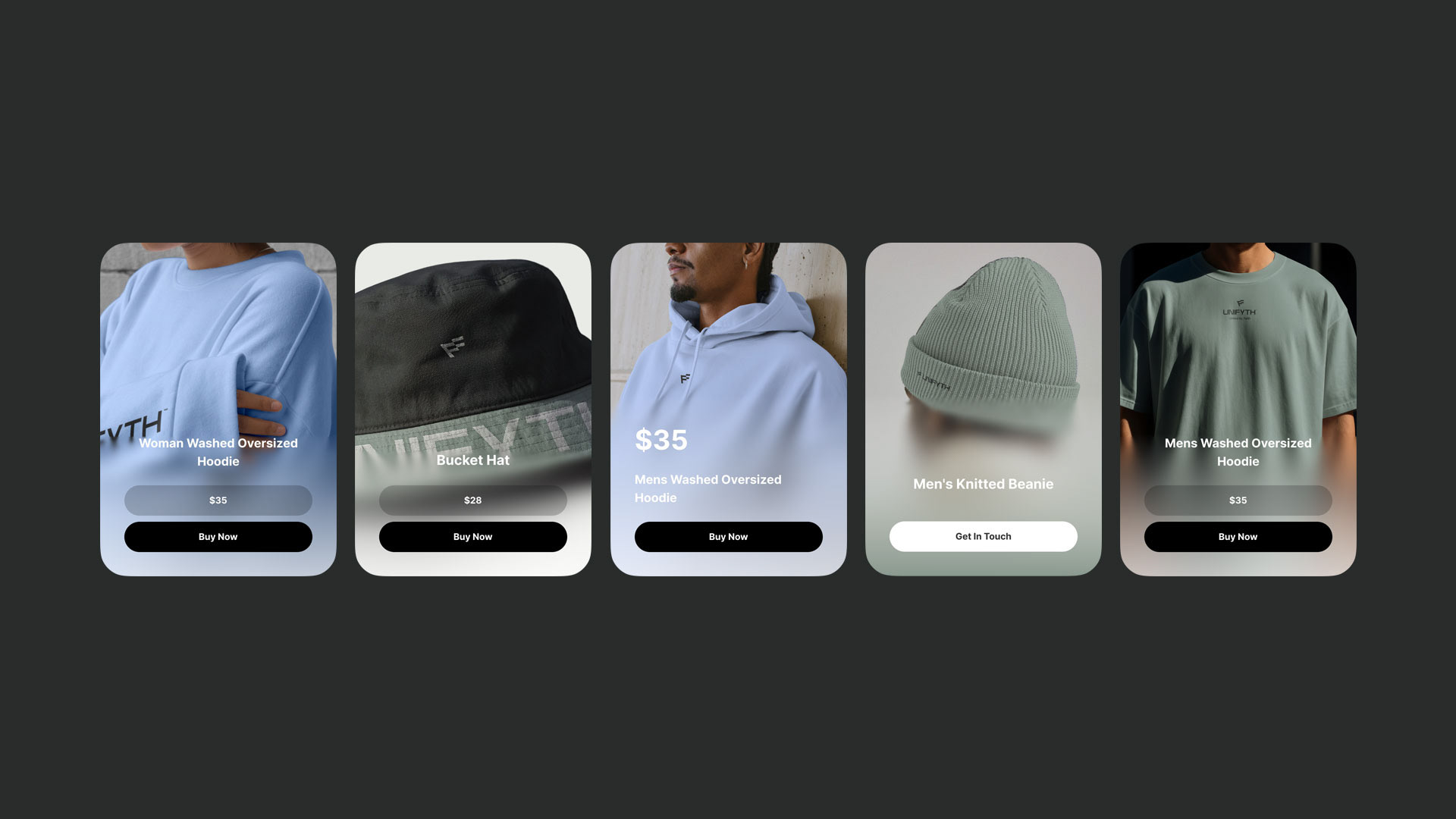
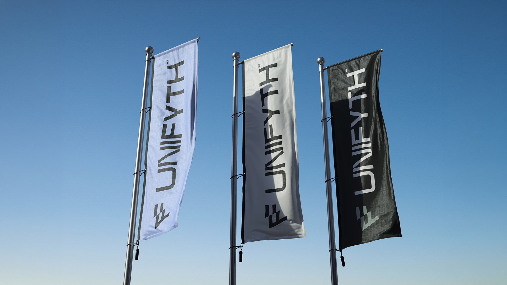
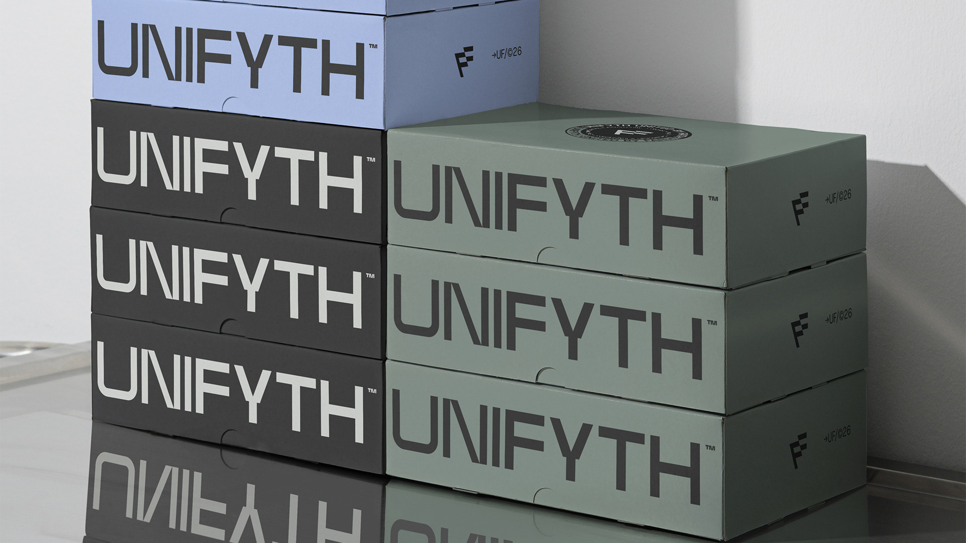
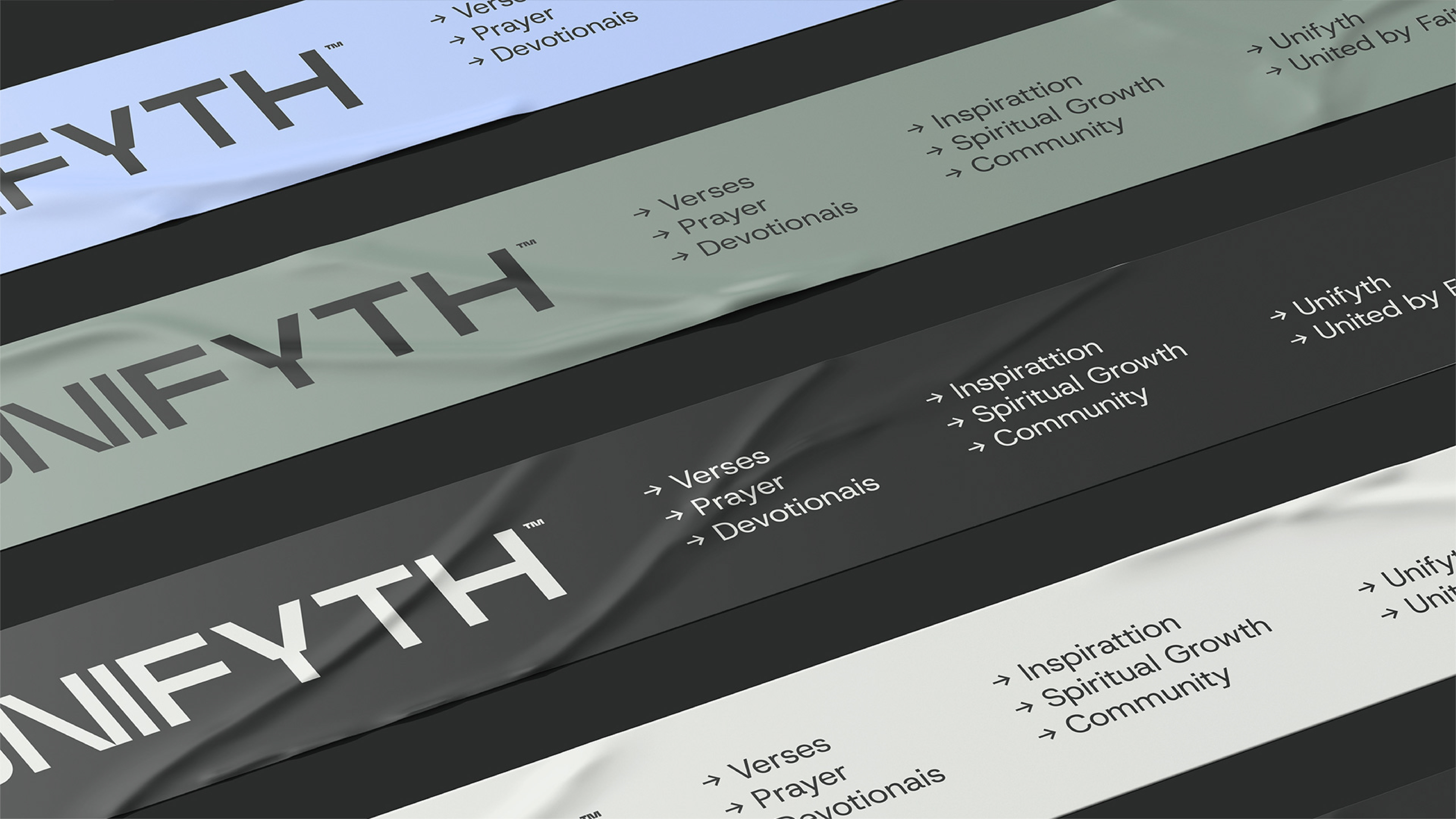
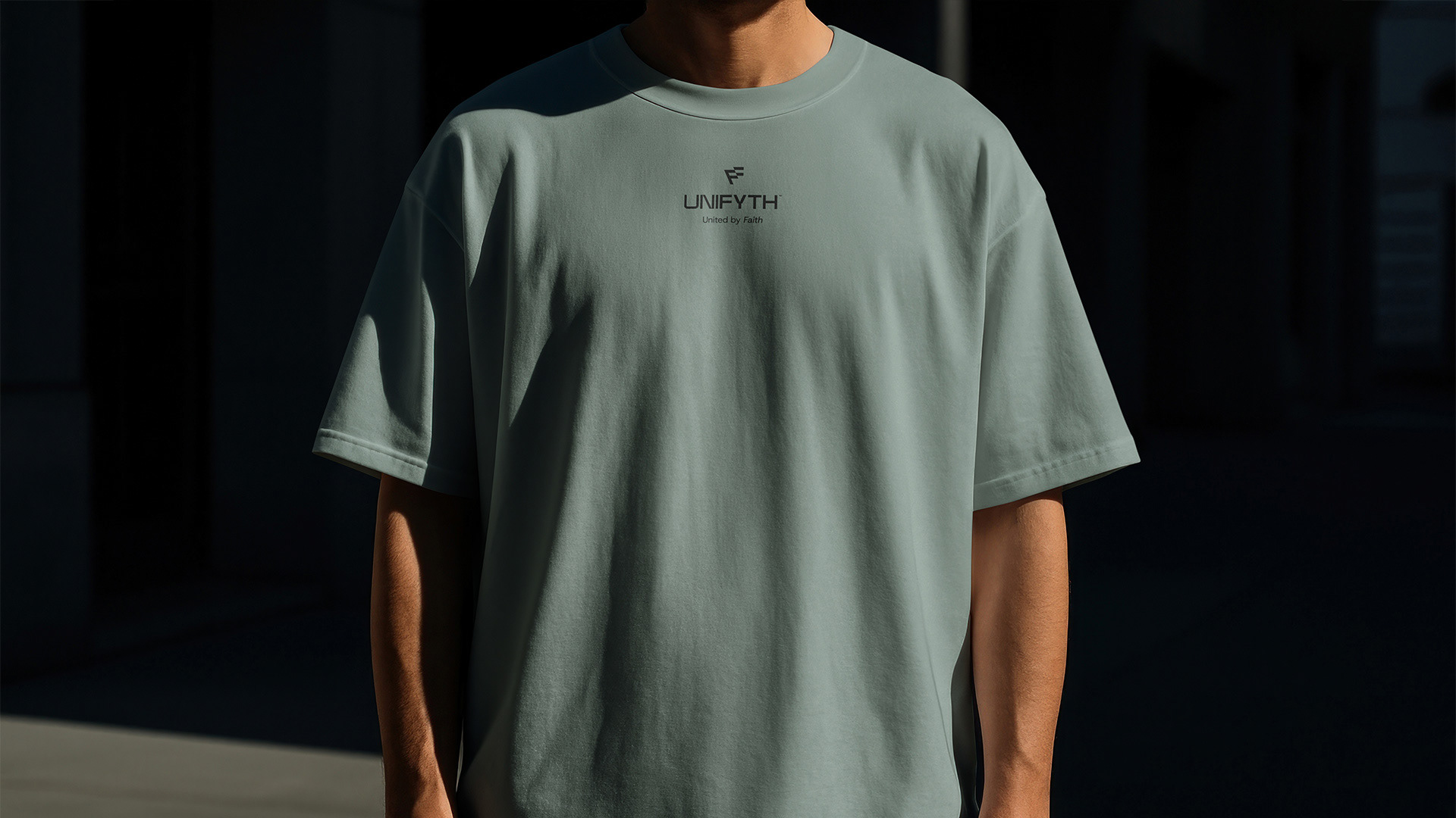
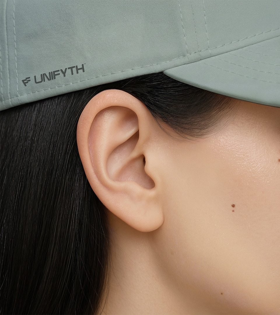
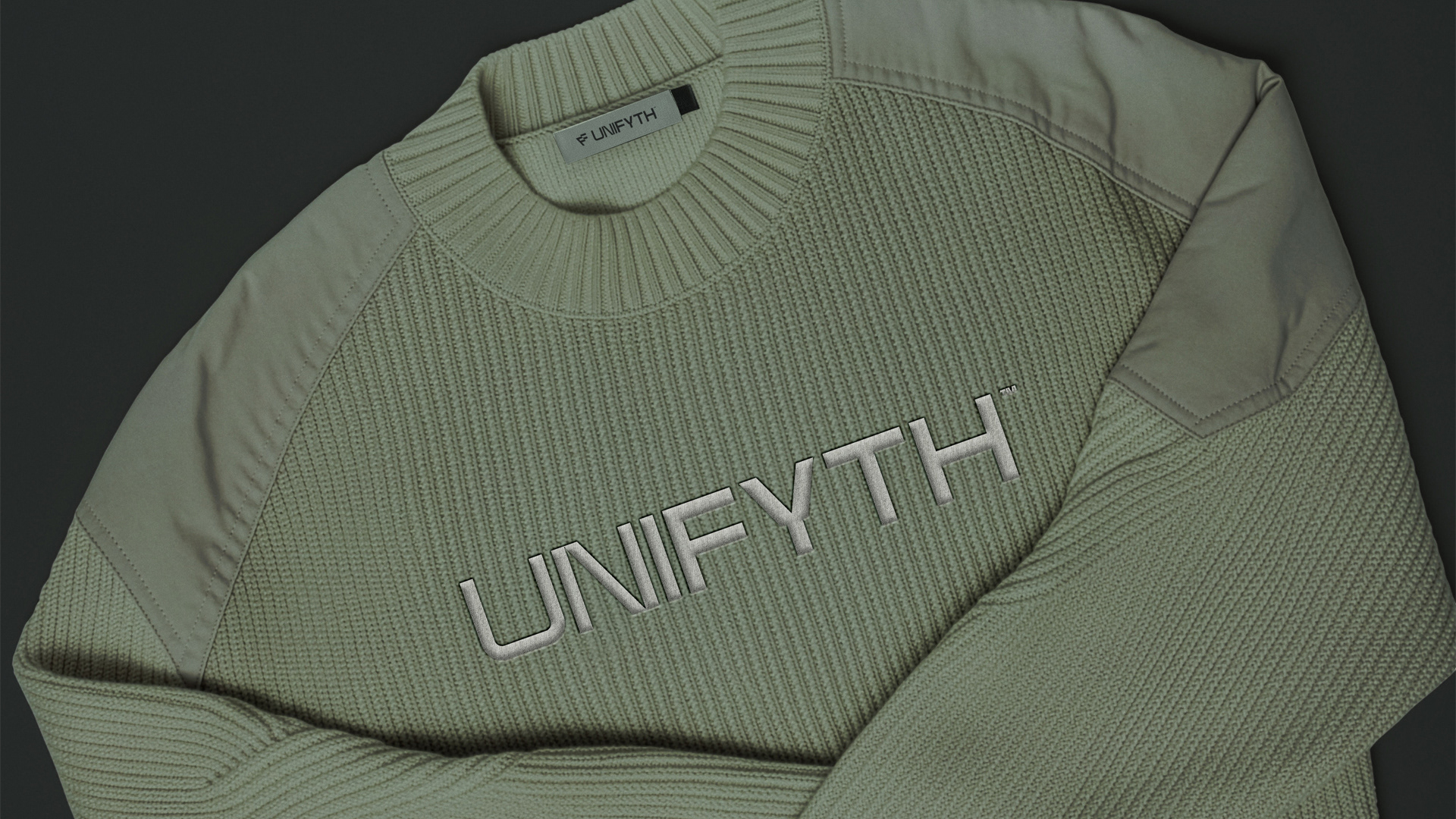
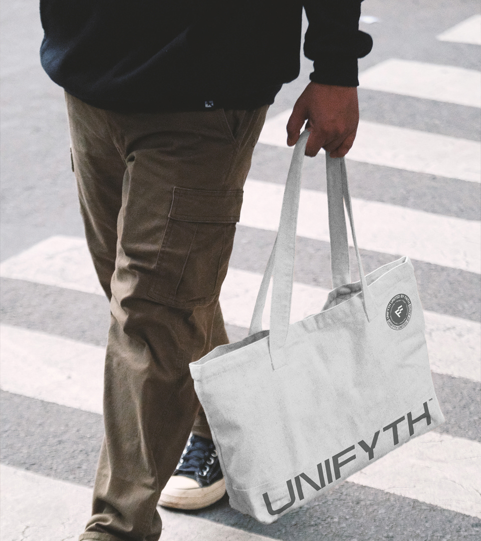
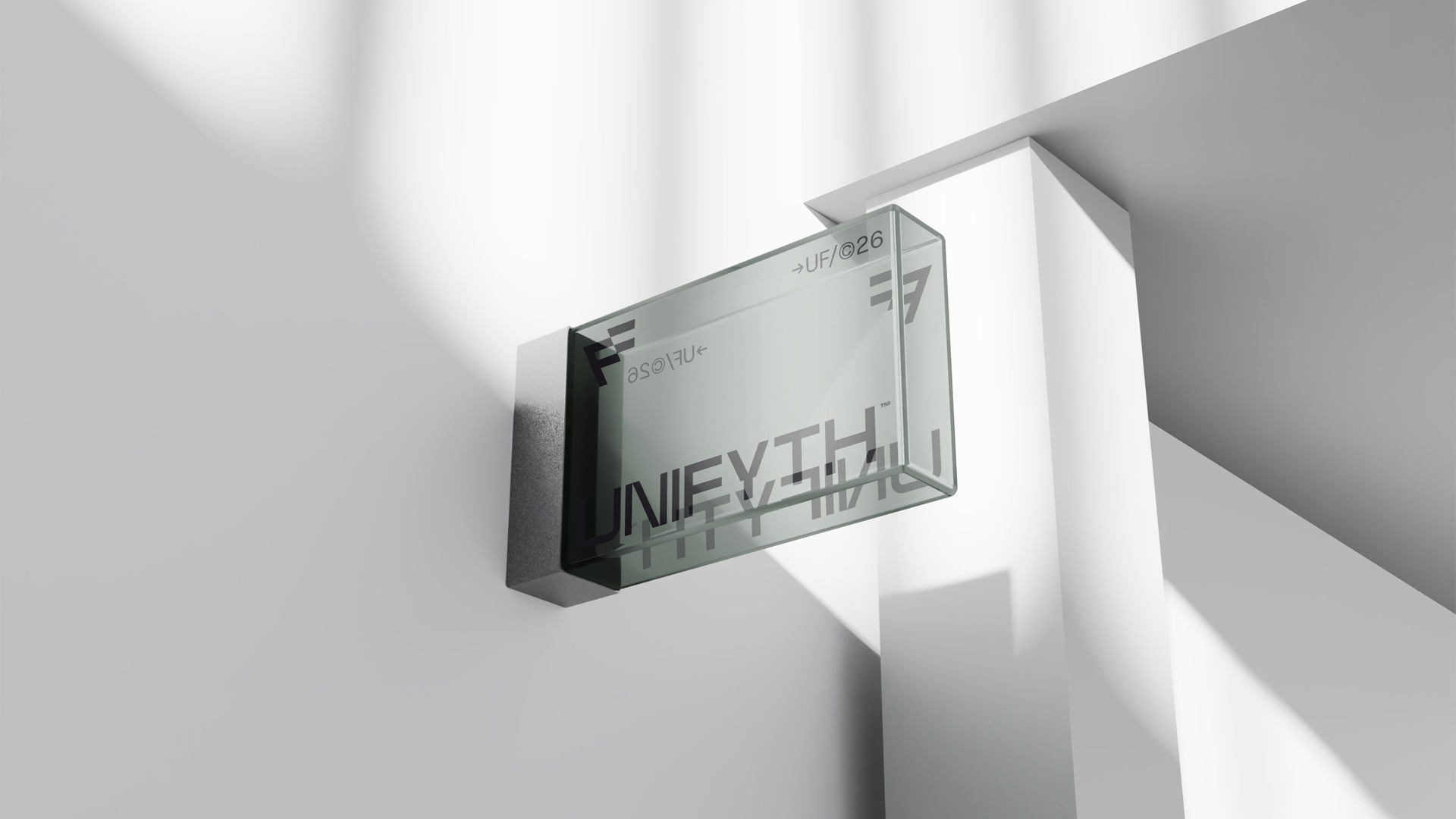
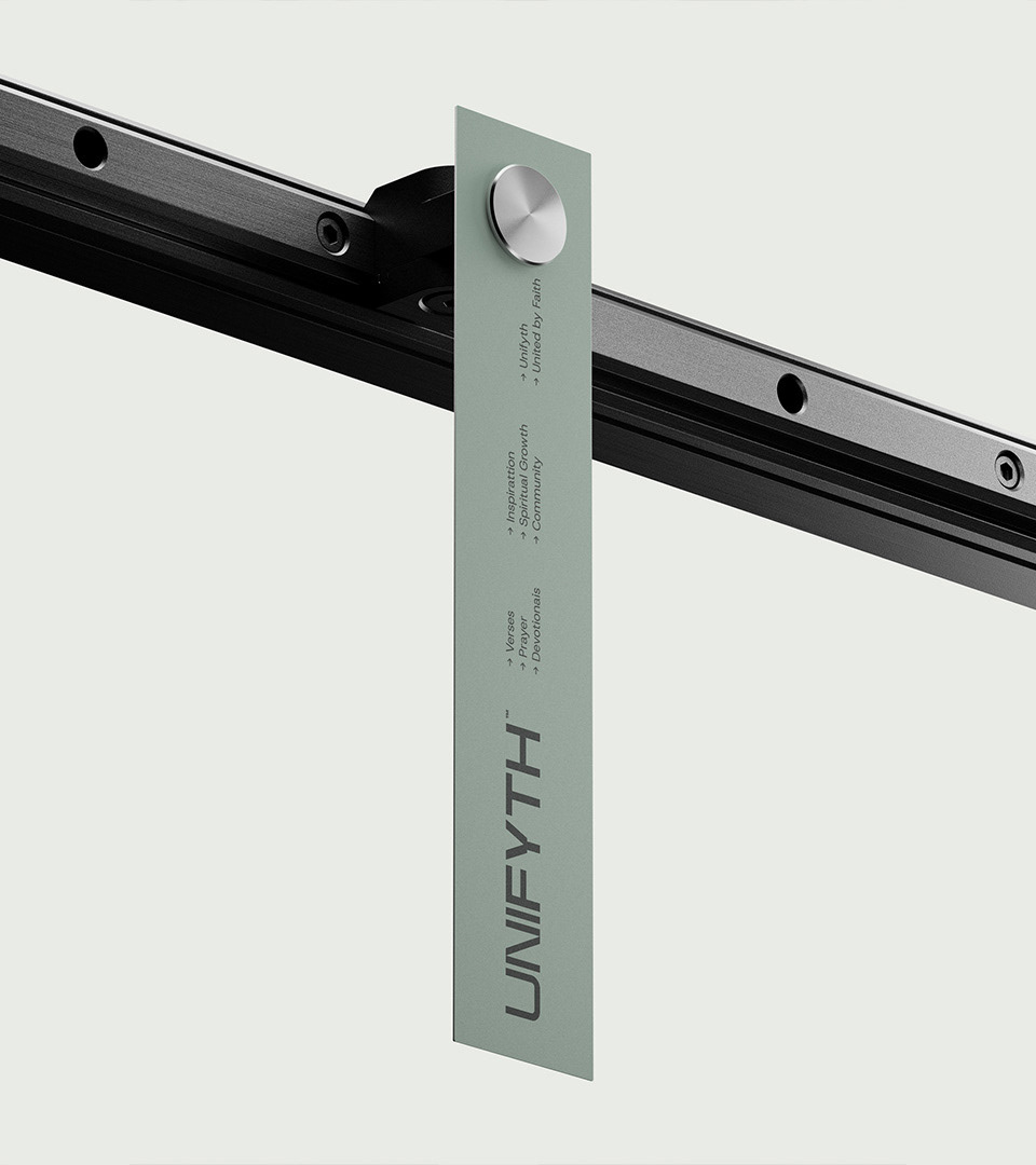
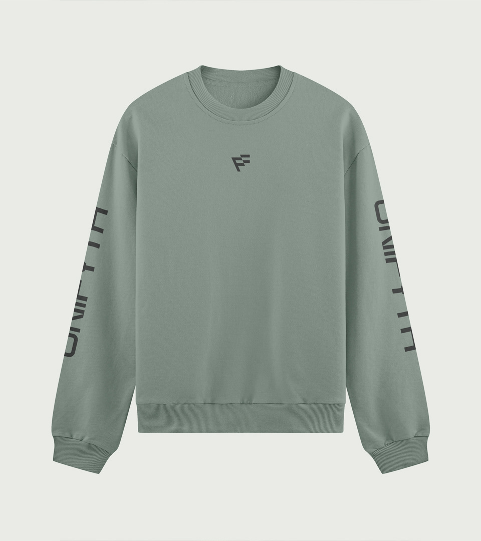
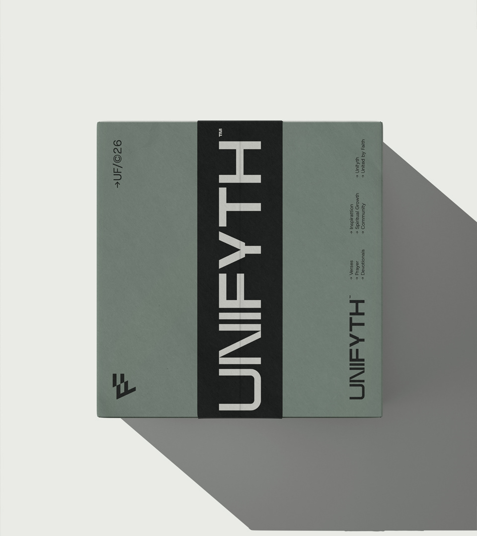
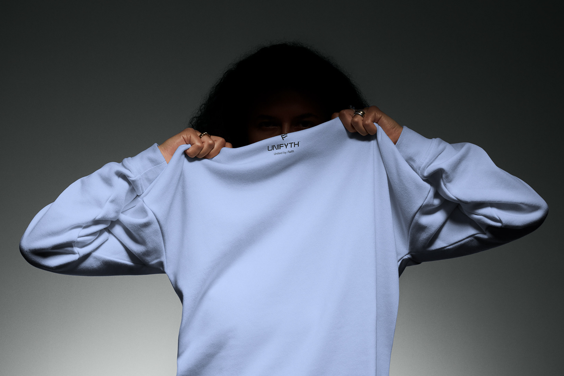
Its construction through thick, strong lines ensures flawless, high-contrast application across all touchpoints, from embroidery on premium hoodies to tags, refined packaging, and digital platforms.
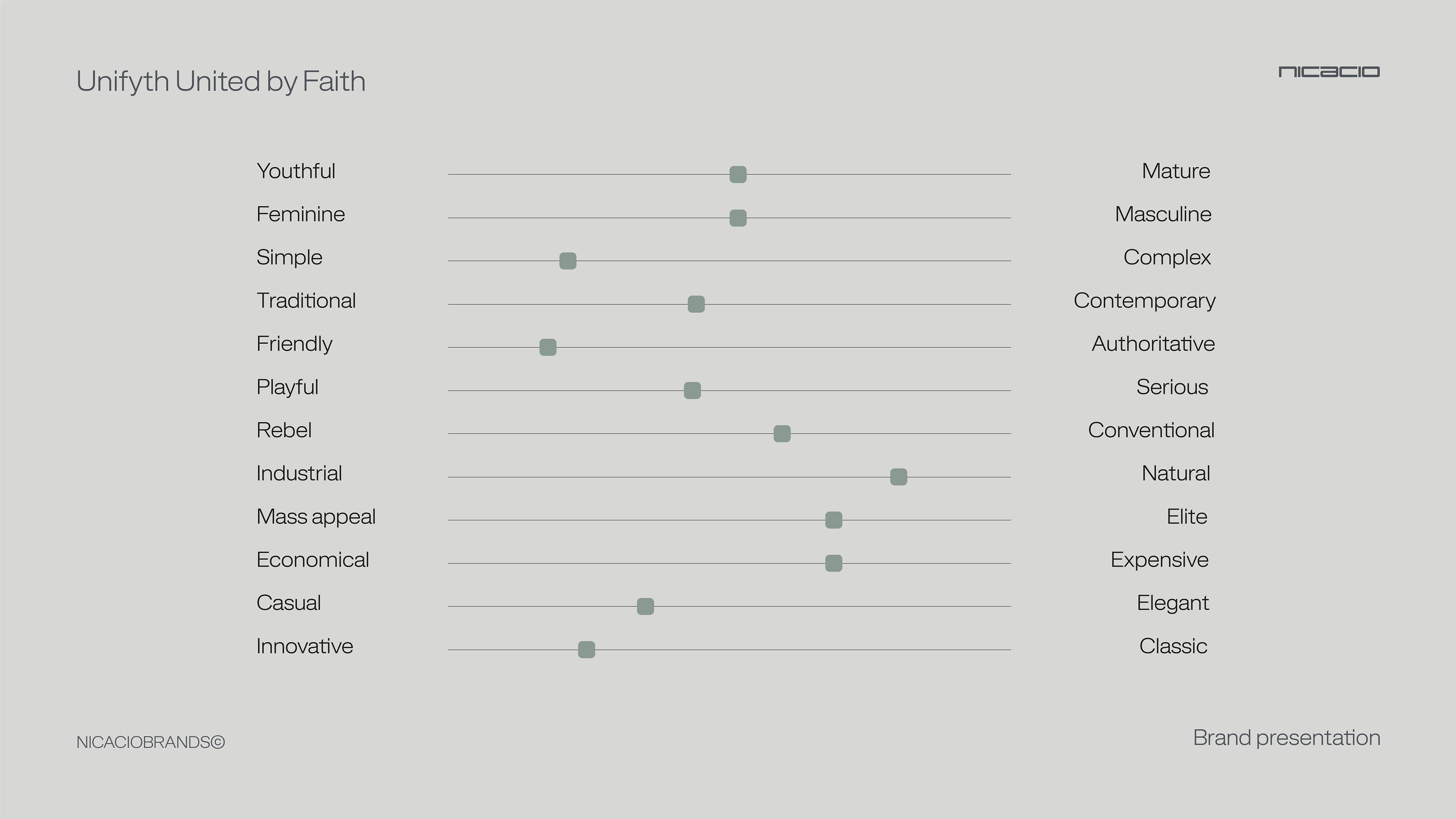
The aesthetic is intentionally unisex and timeless, perfectly connecting with an audience of young professionals and creatives seeking to express their beliefs in a subtle and elevated manner.
4. Strategic Conclusion
This symbol goes far beyond a graphic logo ; it acts as a seal of belonging to a complete ecosystem driven by real purpose.
This symbol goes far beyond a graphic logo ; it acts as a seal of belonging to a complete ecosystem driven by real purpose.
It fulfills the mission of being modern, clean, and high-impact, allowing individuals to carry their faith into their daily lives with a luxury aesthetic.
By abandoning conventional religious imagery in favor of an abstract, typographic identity, UNIFYTH consolidates its vision of being a distinct, scalable, and global lifestyle brand.
Project: Unifyth
Country: United States
Country: United States
Segment: Urban gospel apparel
Year: 2025
Scope: Naming, branding, and visual identity
Art Direction and Creative Direction: Jonas Nicácio
Year: 2025
Scope: Naming, branding, and visual identity
Art Direction and Creative Direction: Jonas Nicácio